

Table of Contents
Why Is Retro Color Palettes Trending in Design?
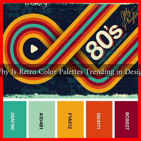
In recent years, the design world has seen a resurgence of retro color palettes, drawing inspiration from the vibrant hues and distinctive styles of past decades. This trend is not merely a nostalgic nod to bygone eras; it reflects deeper cultural shifts and consumer preferences. In this article, we will explore the reasons behind the popularity of retro color palettes in design, supported by examples, case studies, and relevant statistics.
The Allure of Nostalgia
Nostalgia plays a significant role in the appeal of retro color palettes. As people yearn for simpler times, designers are tapping into this sentiment by incorporating colors that evoke memories of childhood, classic films, and vintage products. The emotional connection to these colors can create a sense of comfort and familiarity.
- Emotional Resonance: Colors like pastel pinks, muted greens, and warm yellows can evoke feelings of happiness and nostalgia.
- Connection to Heritage: Many brands are using retro palettes to connect with their heritage, appealing to consumers’ desire for authenticity.
Influence of Pop Culture
Pop culture significantly influences design trends, and retro color palettes are no exception. The resurgence of vintage aesthetics in movies, television shows, and music has led to a renewed interest in the colors associated with those eras.
- Television and Film: Shows like “Stranger Things” and “The Marvelous Mrs. Maisel” have popularized 80s and 50s aesthetics, respectively, leading to a revival of corresponding color schemes.
- Music Trends: The rise of synthwave and retro-inspired music genres has also contributed to the popularity of neon colors and bold contrasts.
Psychological Impact of Color
Colors have a profound psychological impact on individuals, influencing mood and behavior. Retro color palettes often feature bold, saturated colors that can evoke strong emotional responses.
- Warm Colors: Reds, oranges, and yellows can stimulate feelings of excitement and energy.
- Cool Colors: Blues and greens can create a sense of calm and tranquility.
Designers are increasingly aware of these psychological effects and are using retro palettes to create specific atmospheres in their work. For instance, a brand aiming to convey a sense of fun and creativity might opt for a vibrant 80s-inspired palette.
Case Studies: Brands Embracing Retro Color Palettes
Several brands have successfully integrated retro color palettes into their designs, demonstrating the trend’s effectiveness in capturing consumer attention.
- Fanta: The beverage brand revamped its packaging with bright, retro-inspired colors that evoke a sense of fun and playfulness, appealing to both nostalgic adults and younger consumers.
- Airbnb: The company’s marketing campaigns have utilized retro color schemes to create a warm, inviting atmosphere, making their platform feel more accessible and friendly.
Statistics Supporting the Trend
Data from various studies indicate that consumers are increasingly drawn to brands that utilize retro aesthetics. According to a survey by Statista, 65% of respondents expressed a preference for brands that incorporate retro elements in their design. This statistic underscores the potential for brands to connect with consumers through nostalgia-driven aesthetics.
Conclusion: The Future of Retro Color Palettes in Design
The trend of retro color palettes in design is more than just a fleeting fad; it reflects a complex interplay of nostalgia, cultural influences, and psychological impact. As brands continue to seek authentic connections with consumers, the use of retro colors will likely remain a powerful tool in their design arsenals. By tapping into the emotional resonance of these palettes, designers can create compelling visuals that not only attract attention but also foster lasting connections with their audiences.
In summary, the resurgence of retro color palettes is a testament to the enduring power of nostalgia and the influence of pop culture. As we move forward, it will be fascinating to see how this trend evolves and continues to shape the design landscape.
