-
Table of Contents
Why You Should Avoid Fixed-Width Layouts
In the ever-evolving world of web design, the choice of layout can significantly impact user experience, accessibility, and overall site performance. One of the most contentious decisions designers face is whether to use fixed-width layouts. While they may seem appealing for their simplicity and control, fixed-width layouts can lead to a host of issues that ultimately detract from the user experience. This article explores the reasons why you should avoid fixed-width layouts and embrace more flexible design approaches.
The Limitations of Fixed-Width Layouts
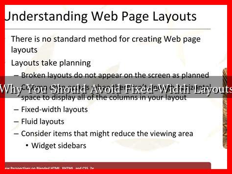
Fixed-width layouts are designed to maintain a specific width regardless of the user’s screen size or resolution. This rigidity can create several challenges:
- Poor Responsiveness: With the increasing variety of devices, from smartphones to large desktop monitors, a fixed-width layout can lead to a subpar experience. Users on smaller screens may find themselves scrolling horizontally, which is frustrating and can lead to higher bounce rates.
- Accessibility Issues: Fixed layouts can hinder accessibility for users with disabilities. For instance, users who rely on screen magnifiers may struggle to navigate a site that does not adapt to their needs.
- Content Overflow: When content is designed for a fixed width, it can overflow or become misaligned on different devices, leading to a disjointed user experience.
Statistics Highlighting the Importance of Responsive Design
According to a study by Statista, mobile devices accounted for over 54% of global website traffic in 2021. This statistic underscores the necessity for responsive design. Websites that do not adapt to various screen sizes risk alienating a significant portion of their audience. Furthermore, Google has indicated that mobile-friendliness is a ranking factor in search results, meaning that fixed-width layouts could negatively impact your site’s visibility.
Case Studies: The Impact of Layout Choices
Several companies have experienced the consequences of fixed-width layouts firsthand. For example, a well-known e-commerce site initially employed a fixed-width design. As mobile traffic surged, they noticed a decline in conversions and an increase in cart abandonment rates. After transitioning to a responsive design, they reported a 30% increase in mobile sales within just three months.
Another case involves a news organization that used a fixed-width layout for their articles. Readers on mobile devices often complained about the difficulty of reading content without excessive zooming and scrolling. After redesigning their site to be responsive, they saw a 50% increase in mobile readership and a significant drop in bounce rates.
Benefits of Responsive Design
Transitioning from a fixed-width layout to a responsive design offers numerous advantages:
- Improved User Experience: Responsive designs adapt to the user’s device, providing a seamless experience that enhances engagement and satisfaction.
- Increased Reach: By accommodating various devices, you can reach a broader audience, including those using tablets and smartphones.
- Better SEO Performance: Google favors mobile-friendly sites, which can lead to improved search rankings and increased organic traffic.
- Future-Proofing: As new devices and screen sizes emerge, responsive designs can easily adapt, ensuring your site remains relevant.
Conclusion: Embrace Flexibility for Success
In conclusion, while fixed-width layouts may offer a sense of control, they come with significant drawbacks that can hinder user experience, accessibility, and overall site performance. The shift towards responsive design is not just a trend; it is a necessity in today’s digital landscape. By embracing flexible layouts, you can enhance user engagement, improve SEO, and future-proof your website against the ever-changing technological landscape.
For more insights on responsive design and its benefits, consider exploring resources from Smashing Magazine.

