-
Table of Contents
What Are the Essential Elements of Responsive Web Design
In today’s digital landscape, where users access websites from a myriad of devices, responsive web design (RWD) has become a crucial aspect of web development. Responsive web design ensures that a website’s layout adapts seamlessly to different screen sizes, providing an optimal user experience across devices. This article explores the essential elements of responsive web design, offering insights into best practices and real-world applications.
Understanding Responsive Web Design
Responsive web design is an approach that allows web pages to render well on a variety of devices and window or screen sizes. The primary goal is to create a single website that provides a consistent experience, regardless of how users access it. According to a report by Statista, mobile devices accounted for over 54% of global website traffic in 2021, highlighting the importance of RWD.
Key Elements of Responsive Web Design
To create an effective responsive web design, several essential elements must be considered:
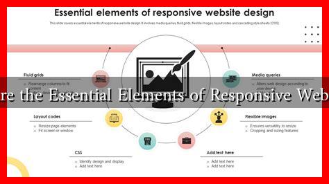
- Fluid Grids: Fluid grids use relative units like percentages instead of fixed units like pixels. This allows elements to resize proportionally based on the screen size. For example, a layout designed with a fluid grid will adjust the width of columns and images to fit the screen, ensuring a cohesive look.
- Flexible Images: Images should also be responsive. By using CSS properties like max-width: 100%, images can scale within their containing elements, preventing overflow and maintaining visual integrity across devices.
- Media Queries: Media queries are a cornerstone of responsive design. They allow developers to apply different styles based on the device’s characteristics, such as screen width, height, and resolution. For instance, a media query can change the layout from a multi-column format on desktops to a single-column format on mobile devices.
- Viewport Meta Tag: The viewport meta tag is essential for controlling the layout on mobile browsers. It instructs the browser on how to adjust the page’s dimensions and scaling. A common implementation is:
<meta name="viewport" content="width=device-width, initial-scale=1">. - Responsive Typography: Text should also adapt to different screen sizes. Using relative units like ems or rems for font sizes ensures that text remains readable on all devices. Additionally, adjusting line height and letter spacing can enhance readability.
Best Practices for Implementing Responsive Web Design
Implementing responsive web design effectively requires adherence to best practices:
- Prioritize Mobile-First Design: Start designing for the smallest screens first and progressively enhance the design for larger screens. This approach ensures that essential content is prioritized and that the design is user-friendly on mobile devices.
- Test Across Devices: Regularly test your website on various devices and browsers to ensure compatibility and usability. Tools like BrowserStack can help simulate different environments.
- Optimize Performance: A responsive website should load quickly on all devices. Optimize images, leverage browser caching, and minimize HTTP requests to enhance performance.
- Use a Responsive Framework: Consider using frameworks like Bootstrap or Foundation, which provide pre-built responsive components and grid systems, making it easier to implement RWD.
Case Studies and Real-World Examples
Several companies have successfully implemented responsive web design, leading to improved user engagement and conversion rates:
- Starbucks: The Starbucks website is a prime example of responsive design. It offers a seamless experience across devices, allowing users to browse the menu, find stores, and place orders effortlessly.
- Amazon: Amazon’s responsive design adapts to various screen sizes, ensuring that users can shop conveniently from any device. This adaptability has contributed to their significant mobile sales growth.
Conclusion
Responsive web design is no longer optional; it is a necessity in today’s mobile-driven world. By incorporating essential elements such as fluid grids, flexible images, media queries, and responsive typography, developers can create websites that provide an optimal user experience across all devices. Following best practices and learning from successful case studies can further enhance the effectiveness of RWD. As the digital landscape continues to evolve, embracing responsive design will be crucial for businesses aiming to engage users and drive conversions.
For more information on responsive web design, you can visit Smashing Magazine.

