-
Table of Contents
- How to Interpret Data Visualization Trends in Graphic Design
- The Importance of Data Visualization in Graphic Design
- Key Trends in Data Visualization
- Interpreting Data Visualization Trends
- 1. Analyze the Audience
- 2. Evaluate the Data Source
- 3. Look for Patterns
- 4. Consider Context
- Case Studies: Successful Data Visualization
- Conclusion
How to Interpret Data Visualization Trends in Graphic Design
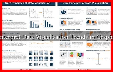
In the digital age, data visualization has become an essential tool for graphic designers, marketers, and business analysts alike. The ability to interpret data trends effectively can lead to better decision-making and more impactful design. This article explores how to interpret data visualization trends in graphic design, providing insights, examples, and practical tips for designers looking to enhance their skills.
The Importance of Data Visualization in Graphic Design
Data visualization transforms complex data sets into visual formats that are easier to understand. This is particularly important in graphic design, where the goal is to communicate information clearly and effectively. Here are some reasons why data visualization is crucial:
- Enhanced Understanding: Visual representations of data can simplify complex information, making it accessible to a broader audience.
- Quick Insights: Well-designed visuals allow viewers to grasp trends and patterns at a glance, facilitating quicker decision-making.
- Engagement: Engaging visuals can capture attention and encourage interaction, making the data more memorable.
Key Trends in Data Visualization
As technology and design practices evolve, several trends have emerged in data visualization. Understanding these trends can help designers create more effective graphics. Here are some notable trends:
- Minimalism: A trend towards simplicity helps to focus the viewer’s attention on the data itself, reducing distractions from unnecessary elements.
- Interactive Visualizations: Interactive elements allow users to engage with the data, exploring different facets and gaining deeper insights.
- Storytelling with Data: Combining narrative techniques with data visualization can create a compelling story that resonates with the audience.
- Use of Color and Typography: Strategic use of color and typography can enhance readability and draw attention to key data points.
Interpreting Data Visualization Trends
Interpreting trends in data visualization requires a keen eye and an understanding of both design principles and data analysis. Here are some strategies to help you interpret these trends effectively:
1. Analyze the Audience
Understanding the target audience is crucial. Different demographics may respond differently to various visualization styles. For instance, a younger audience may prefer interactive and colorful designs, while a more professional audience might favor minimalist and straightforward visuals.
2. Evaluate the Data Source
The credibility of the data source can significantly impact the interpretation of trends. Always check the reliability of the data before drawing conclusions. For example, data from reputable organizations like Statista or government databases is generally more trustworthy than unverified sources.
3. Look for Patterns
Identifying patterns in the data can reveal underlying trends. For example, if a line graph shows a consistent upward trend over several months, it may indicate growing interest or demand for a product or service.
4. Consider Context
Context is key when interpreting data visualizations. Factors such as economic conditions, cultural shifts, or technological advancements can influence data trends. For instance, a spike in online shopping data during the pandemic can be attributed to changing consumer behavior.
Case Studies: Successful Data Visualization
Several companies have successfully utilized data visualization to enhance their graphic design efforts. Here are a couple of notable examples:
- Spotify: The “Wrapped” campaign uses data visualization to present users with personalized insights about their listening habits, creating a shareable experience that engages users.
- Airbnb: Their “Data-Driven Design” approach uses data visualization to analyze user behavior, leading to more effective design decisions that enhance user experience.
Conclusion
Interpreting data visualization trends in graphic design is a multifaceted skill that combines analytical thinking with creative design. By understanding the importance of data visualization, staying updated on current trends, and employing effective interpretation strategies, designers can create impactful visuals that communicate complex information clearly. As the field continues to evolve, embracing these practices will be essential for any graphic designer looking to make a mark in the industry.

