-
Table of Contents
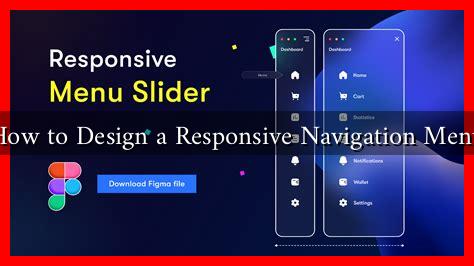
How to Design a Responsive Navigation Menu
In the digital age, a website’s navigation menu is crucial for user experience and engagement. A well-designed responsive navigation menu not only enhances usability but also contributes to the overall aesthetic of a website. This article will explore the essential elements of creating a responsive navigation menu, supported by examples, case studies, and statistics.
Understanding Responsive Design
Responsive design refers to the approach of creating web pages that adapt to various screen sizes and orientations. With the increasing use of mobile devices, having a responsive navigation menu is more important than ever. According to Statista, as of 2023, mobile devices accounted for over 54% of global website traffic. This statistic underscores the necessity for a navigation menu that functions seamlessly across all devices.
Key Principles of a Responsive Navigation Menu
When designing a responsive navigation menu, several key principles should be considered:
- Simplicity: A cluttered menu can overwhelm users. Aim for a clean and straightforward design that highlights the most important links.
- Accessibility: Ensure that your menu is easy to navigate for all users, including those with disabilities. Use clear labels and consider keyboard navigation.
- Consistency: Maintain a consistent style and structure across all pages of your website to help users familiarize themselves with the navigation.
- Mobile-first approach: Design for mobile devices first, then scale up for larger screens. This approach ensures that the most critical elements are prioritized.
Types of Responsive Navigation Menus
There are several popular types of responsive navigation menus, each with its own advantages:
- Hamburger Menu: This icon-based menu is popular for mobile devices. It saves space and can expand to show additional options when clicked.
- Dropdown Menu: This type allows users to hover or click to reveal subcategories, making it easier to organize content hierarchically.
- Tab Navigation: Ideal for websites with a limited number of sections, tab navigation allows users to switch between different content areas easily.
Best Practices for Designing a Responsive Navigation Menu
To create an effective responsive navigation menu, consider the following best practices:
- Prioritize Content: Identify the most important links and place them prominently in the menu. Use analytics tools to determine which pages receive the most traffic.
- Use Clear Labels: Ensure that menu items are labeled clearly and concisely. Avoid jargon and use language that resonates with your target audience.
- Test Across Devices: Regularly test your navigation menu on various devices and screen sizes to ensure it functions correctly and is visually appealing.
- Incorporate Visual Cues: Use icons or color changes to indicate active links or dropdowns, helping users understand their current location within the site.
Case Study: Successful Responsive Navigation Menus
One notable example of a successful responsive navigation menu is that of Apple. Their website features a clean, minimalist design with a hamburger menu on mobile devices that expands to reveal a well-organized list of products and services. This design not only enhances user experience but also aligns with Apple’s brand identity of simplicity and elegance.
Another example is Airbnb, which utilizes a tab navigation system on its mobile site. This allows users to quickly switch between different sections, such as “Stays,” “Experiences,” and “Online Experiences,” making it easy to navigate their offerings.
Conclusion
Designing a responsive navigation menu is a critical aspect of web design that can significantly impact user experience and engagement. By adhering to key principles such as simplicity, accessibility, and consistency, and by employing best practices like prioritizing content and testing across devices, you can create a navigation menu that enhances usability across all platforms. As demonstrated by successful case studies like Apple and Airbnb, a well-designed responsive navigation menu not only improves user satisfaction but also contributes to the overall success of a website. Embrace these strategies to ensure your website remains user-friendly and visually appealing in an increasingly mobile world.

