-
Table of Contents
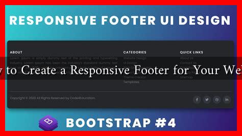
How to Create a Responsive Footer for Your Website
In the digital age, a website’s footer is often overlooked, yet it plays a crucial role in user experience and navigation. A well-designed footer can enhance usability, improve SEO, and provide essential information to visitors. This article will guide you through the process of creating a responsive footer that not only looks good but also functions effectively across various devices.
Understanding the Importance of a Footer
The footer is the last section of a webpage, and it serves multiple purposes:
- Navigation: It can provide links to important pages, helping users find what they need quickly.
- Contact Information: Including contact details fosters trust and encourages communication.
- Legal Information: Footers often contain links to privacy policies, terms of service, and copyright notices.
- Social Media Links: They can direct users to your social media profiles, enhancing engagement.
According to a study by Nielsen Norman Group, users often scroll to the footer for information, making it a vital area for content placement.
Key Elements of a Responsive Footer
Creating a responsive footer involves several key elements that ensure it adapts well to different screen sizes. Here are the essential components:
- Clear Layout: Use a grid system to organize content. This helps maintain structure across devices.
- Contact Information: Include your business address, phone number, and email. Make sure these are clickable on mobile devices.
- Navigation Links: Provide links to key pages like About Us, Services, and Blog. Limit the number of links to avoid clutter.
- Social Media Icons: Use recognizable icons that link to your social media profiles. Ensure they are large enough to tap easily on mobile devices.
- Newsletter Signup: Encourage users to subscribe to your newsletter for updates and promotions.
Designing a Responsive Footer
When designing your footer, consider the following best practices:
- Use CSS Flexbox or Grid: These CSS properties allow for flexible layouts that adjust based on screen size.
- Keep It Simple: Avoid overcrowding the footer with too much information. A clean design enhances readability.
- Test Across Devices: Ensure your footer looks good on desktops, tablets, and smartphones. Use tools like Google’s Mobile-Friendly Test to check responsiveness.
- Consistent Branding: Use colors, fonts, and styles that align with your overall website design to maintain brand consistency.
Examples of Effective Footers
Several websites exemplify effective footer design:
- Apple: Their footer is clean and organized, featuring links to support, legal information, and social media.
- Dropbox: Offers a simple layout with essential links and a clear call-to-action for newsletter signup.
- Amazon: Provides extensive navigation options while maintaining a clean design, making it easy for users to find what they need.
Case Study: The Impact of a Responsive Footer
A case study conducted by Smashing Magazine revealed that websites with well-structured footers saw a 20% increase in user engagement. The study highlighted that users appreciated having easy access to information without scrolling back to the top of the page.
Conclusion
Creating a responsive footer is an essential aspect of web design that can significantly enhance user experience. By incorporating key elements such as clear navigation, contact information, and social media links, you can create a footer that not only looks good but also serves its purpose effectively. Remember to keep your design simple, test across devices, and maintain brand consistency. A well-designed footer can lead to increased engagement and trust, ultimately benefiting your website’s overall performance.

