-
Table of Contents
- How Do I Evaluate If My Color Choices Are Too Bland?
- Understanding Color Theory
- Signs Your Color Choices May Be Too Bland
- Evaluating Your Color Choices
- 1. Analyze Your Color Palette
- 2. Seek Inspiration
- 3. Experiment with Color Combinations
- 4. Test in Context
- Case Studies: Successful Color Choices
- Conclusion
How Do I Evaluate If My Color Choices Are Too Bland?
Color plays a crucial role in design, branding, and personal expression. Whether you are decorating a room, designing a website, or choosing an outfit, the colors you select can significantly impact the overall aesthetic and emotional response. However, many people struggle with determining if their color choices are too bland. This article will guide you through evaluating your color palette and provide tips to enhance your selections.
Understanding Color Theory
Before diving into evaluation, it’s essential to understand the basics of color theory. Color theory encompasses the principles of how colors interact, the emotional responses they evoke, and how they can be combined effectively. Here are some key concepts:
- Color Wheel: The color wheel is a visual representation of colors arranged according to their chromatic relationship. Primary, secondary, and tertiary colors are all included.
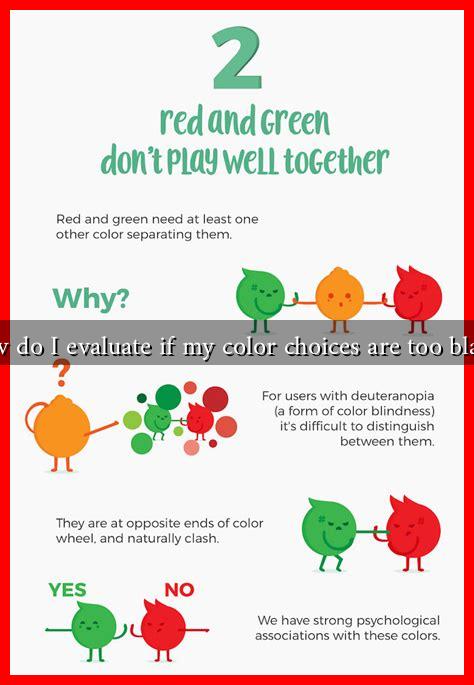
- Complementary Colors: These are colors located opposite each other on the color wheel, such as blue and orange. They create a vibrant contrast when used together.
- Analogous Colors: These colors are next to each other on the color wheel, like blue, blue-green, and green. They create a harmonious look.
- Monochromatic Colors: This scheme uses variations in lightness and saturation of a single color, which can sometimes lead to a bland appearance if not balanced well.
Signs Your Color Choices May Be Too Bland
Identifying bland color choices can be subjective, but there are several indicators to consider:
- Lack of Contrast: If your color palette lacks contrast, it may appear flat. For example, using various shades of beige can create a dull look.
- Emotional Response: Colors evoke emotions. If your choices do not elicit any feelings or excitement, they may be too muted.
- Visual Interest: A bland palette often lacks visual interest. If your design feels monotonous or uninviting, it may be time to reassess your colors.
- Feedback from Others: Sometimes, external opinions can provide valuable insights. If friends or colleagues describe your color choices as “safe” or “uninspired,” it may be worth exploring bolder options.
Evaluating Your Color Choices
To evaluate your color choices effectively, consider the following steps:
1. Analyze Your Color Palette
Take a close look at your current color palette. Are you using a variety of colors, or are you sticking to a few muted tones? Tools like Adobe Color or Coolors can help you visualize and create more dynamic palettes.
2. Seek Inspiration
Look for inspiration from various sources, such as:
- Art and design websites like Behance or Dribbble
- Nature, which offers a plethora of color combinations
- Fashion trends, which often highlight bold color choices
3. Experiment with Color Combinations
Try mixing and matching different colors to see how they interact. Use tools like Canva’s color palette generator to experiment with complementary and analogous colors.
4. Test in Context
Before finalizing your color choices, test them in the context they will be used. For example, paint a small section of a wall or create a mockup of a website to see how the colors work together in real life.
Case Studies: Successful Color Choices
Many brands have successfully used color to enhance their identity. For instance:
- Airbnb: The company uses a vibrant coral color that evokes warmth and friendliness, making their brand approachable.
- Spotify: The use of bright green against a dark background creates a striking contrast that is both modern and energetic.
These examples illustrate how effective color choices can create a memorable brand identity and evoke specific emotions.
Conclusion
Evaluating whether your color choices are too bland involves understanding color theory, recognizing signs of dullness, and actively experimenting with different palettes. By analyzing your current selections, seeking inspiration, and testing combinations, you can create a more vibrant and engaging aesthetic. Remember, color is not just about aesthetics; it’s about evoking emotions and creating connections. Don’t be afraid to step outside your comfort zone and explore the colorful possibilities!
For more insights on color theory and design, consider visiting Color Matters.

