-
Table of Contents
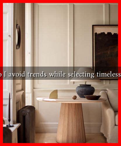
How Do I Avoid Trends While Selecting Timeless Colors?
Choosing colors for your home, wardrobe, or branding can be a daunting task, especially with the ever-changing landscape of trends. While it may be tempting to follow the latest color fads, opting for timeless colors can provide a more enduring aesthetic. This article will guide you through the process of selecting colors that stand the test of time, ensuring your choices remain relevant and appealing for years to come.
Understanding Timeless Colors
Timeless colors are those that have consistently remained popular across different eras and styles. They evoke a sense of stability and sophistication, making them ideal for long-term use. Some classic examples include:
- Neutrals: Whites, grays, and beiges
- Earth tones: Browns, greens, and muted blues
- Classic shades: Navy blue, deep red, and black
These colors are versatile and can be easily paired with various design elements, making them a safe choice for any project.
Researching Color Psychology
Understanding color psychology can significantly influence your color selection process. Different colors evoke different emotions and associations. For instance:
- Blue: Often associated with calmness and trust, making it a popular choice for corporate branding.
- Green: Symbolizes nature and tranquility, ideal for creating a serene environment.
- Red: Represents energy and passion, often used to grab attention.
By considering the psychological impact of colors, you can select hues that not only look good but also resonate with the intended audience or purpose.
Evaluating Historical Context
Colors often reflect cultural and historical contexts. For example, the color palette of the 1960s was heavily influenced by the counterculture movement, while the 1980s favored bold and vibrant colors. To avoid trends, look at historical color palettes that have remained consistent over time. Resources like The Color Association of the United States provide insights into color trends and their historical significance.
Choosing a Color Palette
When selecting a color palette, consider the following strategies to ensure your choices are timeless:
- Limit Your Palette: Stick to a few core colors to create a cohesive look. A palette of three to five colors can provide balance and harmony.
- Incorporate Neutrals: Neutrals can serve as a foundation for your palette, allowing you to add pops of color without overwhelming the space.
- Test in Different Lighting: Colors can appear differently under various lighting conditions. Always test your colors in the actual space before making a final decision.
Case Studies: Successful Timeless Color Choices
Several brands and designers have successfully utilized timeless colors in their work. For instance:
- Apple: The use of white and silver in their product designs has created a sleek, modern aesthetic that remains appealing.
- Chanel: The classic black and white color scheme in their branding has stood the test of time, symbolizing elegance and sophistication.
These examples illustrate how timeless colors can create a lasting impression and brand identity.
Conclusion: Key Takeaways
In conclusion, avoiding trends while selecting timeless colors requires a thoughtful approach that considers color psychology, historical context, and practical application. By limiting your palette, incorporating neutrals, and testing colors in different lighting, you can create a space or brand that remains relevant and appealing over time. Remember, the goal is to choose colors that resonate with you and your audience, ensuring that your selections are not only beautiful but also enduring.
By following these guidelines, you can confidently navigate the world of color selection and create a timeless aesthetic that will stand the test of time.

