-
Table of Contents
How Can I Use Color Theory to Prevent Boring Designs?
In the world of design, color is not just an aesthetic choice; it is a powerful tool that can evoke emotions, convey messages, and influence perceptions. Understanding color theory can help designers create visually appealing and engaging designs that capture attention and communicate effectively. This article explores how to leverage color theory to prevent boring designs and enhance creativity.
The Basics of Color Theory
Color theory is a framework that explains how colors interact with one another and how they can be combined to create harmonious designs. It encompasses various concepts, including the color wheel, color harmony, and the psychological effects of colors. Here are some fundamental elements of color theory:
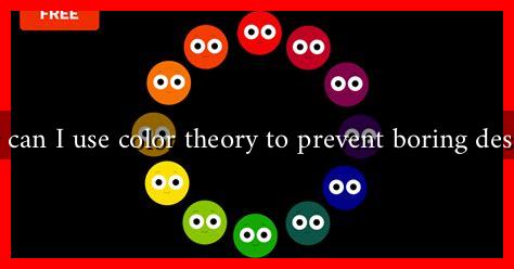
- Color Wheel: The color wheel is a circular diagram that represents the relationships between colors. It includes primary, secondary, and tertiary colors.
- Color Harmony: This refers to the pleasing arrangement of colors. Common color harmonies include complementary, analogous, and triadic schemes.
- Color Psychology: Different colors evoke different emotions. For example, blue is often associated with calmness, while red can evoke excitement or urgency.
Choosing the Right Color Palette
One of the most effective ways to prevent boring designs is to choose a dynamic color palette. Here are some strategies to consider:
- Limit Your Palette: While it may be tempting to use a wide range of colors, limiting your palette to three to five colors can create a more cohesive and striking design.
- Use Contrasting Colors: Incorporating contrasting colors can draw attention to key elements in your design. For example, pairing a bright color with a neutral tone can create a striking visual impact.
- Experiment with Shades and Tints: Instead of using flat colors, explore different shades (darker versions) and tints (lighter versions) of a color to add depth and interest.
Creating Visual Hierarchy with Color
Color can also be used to establish a visual hierarchy in your designs, guiding the viewer’s eye to the most important elements. Here’s how:
- Highlight Key Information: Use bold colors to highlight important information, such as calls to action or headings. For instance, a bright orange button on a blue background can stand out effectively.
- Use Color Gradients: Gradients can add dimension and movement to your designs. For example, a gradient background can create a sense of depth and make the design more engaging.
- Consistent Color Coding: Establish a color code for different types of information. For example, use green for positive actions and red for warnings. This consistency helps users navigate your design intuitively.
Case Studies: Successful Use of Color Theory
Several brands have successfully utilized color theory to enhance their designs and prevent monotony:
- Spotify: The music streaming service uses a vibrant green against a dark background, creating a striking contrast that draws users in and enhances the user experience.
- Airbnb: Their use of a warm color palette evokes feelings of comfort and belonging, aligning perfectly with their brand message of home and hospitality.
- Dropbox: The use of a simple blue and white color scheme conveys trust and reliability, essential qualities for a cloud storage service.
Conclusion: Bringing It All Together
Incorporating color theory into your design process is essential for creating engaging and visually appealing work. By understanding the basics of color theory, choosing the right color palette, and using color to establish visual hierarchy, you can prevent boring designs and captivate your audience. Remember, the key is to experiment and find what resonates with your brand and audience. For further reading on color theory, consider visiting Canva’s Color Wheel.
In summary, color is a vital element in design that can significantly impact how your work is perceived. By applying the principles of color theory, you can create designs that are not only visually appealing but also effective in communicating your message.


