-
Table of Contents
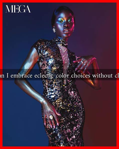
How Can I Embrace Eclectic Color Choices Without Clashing?
Color is a powerful tool in design, fashion, and art. It can evoke emotions, create atmospheres, and even influence behavior. However, when it comes to embracing eclectic color choices, many people fear that their selections may clash rather than harmonize. This article will explore how to embrace a vibrant palette without creating visual chaos, providing practical tips, examples, and insights.
Understanding Color Theory
Before diving into eclectic color choices, it’s essential to understand the basics of color theory. Color theory is a framework that explains how colors interact with one another. Here are some key concepts:
- Color Wheel: The color wheel is a circular diagram of colors arranged by their chromatic relationship. Primary colors (red, blue, yellow) mix to create secondary colors (green, orange, purple).
- Complementary Colors: These are colors located opposite each other on the color wheel (e.g., blue and orange). They create high contrast and can be visually striking when used together.
- Analogous Colors: These colors are next to each other on the color wheel (e.g., blue, blue-green, and green). They create a serene and comfortable design.
- Triadic Colors: This scheme uses three colors that are evenly spaced around the color wheel (e.g., red, yellow, and blue). It offers a balanced yet vibrant palette.
Choosing Your Palette
Once you understand color theory, the next step is to choose a palette that reflects your personality and style. Here are some strategies to consider:
- Start with a Base Color: Choose a dominant color that resonates with you. This will serve as the foundation for your eclectic choices.
- Incorporate Neutrals: Use neutral colors (whites, grays, beiges) to balance out bold colors. They can act as a visual break and help prevent clashing.
- Limit Your Palette: While eclecticism encourages variety, limiting your palette to 3-5 colors can help maintain cohesion.
- Use Patterns Wisely: Patterns can introduce multiple colors without overwhelming the space. Choose patterns that incorporate your selected colors for a unified look.
Creating Harmony in Your Space
To ensure that your eclectic color choices work together harmoniously, consider the following tips:
- Test Swatches: Before committing to a color, test swatches on your walls or fabric. Observe how they look in different lighting conditions.
- Use Color Blocks: Create distinct areas of color within a space. For example, paint one wall a bold color while keeping the others neutral.
- Incorporate Accessories: Use accessories like cushions, rugs, and artwork to introduce color without overwhelming the space.
- Consider the Mood: Different colors evoke different emotions. For instance, blues and greens are calming, while reds and yellows are energizing. Choose colors that align with the mood you want to create.
Case Studies: Successful Eclectic Color Schemes
Many designers and homeowners have successfully embraced eclectic color choices. Here are a few notable examples:
- Kelly Wearstler: This renowned interior designer is known for her bold use of color and pattern. In her designs, she often combines unexpected colors like deep teal with vibrant coral, creating a striking yet harmonious look.
- Jonathan Adler: Adler’s designs often feature a mix of bright colors and patterns. He emphasizes the importance of balance, using neutral furniture to ground his vibrant color choices.
Conclusion
Embracing eclectic color choices can be a rewarding journey that allows for personal expression and creativity. By understanding color theory, carefully selecting your palette, and creating harmony in your space, you can avoid clashing and instead create a vibrant, cohesive environment. Remember to test your colors, incorporate neutrals, and draw inspiration from successful designers. With these strategies, you can confidently embrace an eclectic approach to color that reflects your unique style.
For more insights on color theory and design, consider visiting Adobe Color, a resource that offers tools for creating color palettes and understanding color relationships.

