-
Table of Contents
Does Color Choice in Design Affect Relaxation?
Color is a powerful tool in design, influencing emotions, perceptions, and behaviors. In the realm of relaxation, the choice of color can significantly impact how individuals feel in a given space. This article explores the relationship between color choice in design and its effects on relaxation, supported by research, case studies, and practical examples.
The Psychology of Color
Color psychology is the study of how colors affect human behavior and emotions. Different colors evoke different feelings and responses, which can be harnessed in design to create environments conducive to relaxation. Here are some common associations:
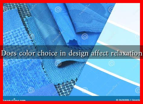
- Blue: Often associated with calmness and serenity, blue can lower heart rates and reduce anxiety.
- Green: Symbolizing nature, green is linked to tranquility and balance, promoting a sense of peace.
- Yellow: While bright and cheerful, yellow can be overstimulating in large doses, potentially leading to anxiety.
- Red: A color of energy and passion, red can increase heart rates and may not be ideal for relaxation.
- Neutral Colors: Shades like beige, gray, and soft whites can create a calming backdrop, allowing other colors to stand out without overwhelming the senses.
Case Studies in Color and Relaxation
Several studies have examined the impact of color on relaxation in various settings, from healthcare facilities to residential spaces. Here are a few notable examples:
- Healthcare Environments: A study published in the journal Health Environments Research & Design found that patients in rooms painted in soft blue and green tones reported lower levels of stress and anxiety compared to those in more vibrant colors.
- Workspaces: Research from the University of Texas revealed that employees in offices with blue and green accents experienced higher levels of focus and lower stress levels, leading to increased productivity and job satisfaction.
- Residential Design: A survey conducted by the American Society of Interior Designers (ASID) indicated that homeowners who incorporated calming colors into their living spaces reported feeling more relaxed and at ease in their homes.
Practical Applications of Color in Design
Understanding the psychological effects of color can help designers create spaces that promote relaxation. Here are some practical applications:
- Choosing a Color Palette: When designing a space intended for relaxation, opt for a color palette that includes soft blues, greens, and neutrals. Avoid overly bright or saturated colors that may create tension.
- Accent Walls: Consider using a calming color for an accent wall in a bedroom or meditation space to create a focal point that promotes tranquility.
- Lighting Considerations: The way colors appear can change with lighting. Soft, warm lighting can enhance the calming effects of colors like blue and green.
- Textiles and Decor: Incorporate calming colors into textiles, such as curtains, cushions, and rugs, to create a cohesive and relaxing environment.
Conclusion
Color choice in design plays a crucial role in influencing relaxation and overall well-being. By understanding the psychological effects of different colors, designers can create spaces that foster calmness and tranquility. Whether in healthcare settings, workplaces, or homes, the strategic use of color can lead to improved mental health and a greater sense of peace. As we continue to explore the intersection of color and psychology, it becomes increasingly clear that thoughtful design can significantly enhance our quality of life.
In summary, when considering color choices in design, it is essential to prioritize hues that promote relaxation. By leveraging the power of color psychology, we can create environments that not only look beautiful but also nurture our mental and emotional well-being.

