-
Table of Contents
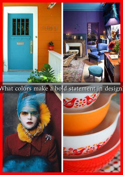
What Colors Make a Bold Statement in Design?
Color is one of the most powerful tools in design, capable of evoking emotions, influencing perceptions, and creating memorable experiences. In a world saturated with visual stimuli, choosing the right colors can make a significant difference in how a design is received. This article explores the colors that make a bold statement in design, backed by research, examples, and case studies.
The Psychology of Color
Understanding the psychology of color is crucial for designers. Colors can evoke specific feelings and associations, which can be leveraged to create impactful designs. Here are some common associations:
- Red: Passion, energy, urgency
- Blue: Trust, calmness, professionalism
- Yellow: Optimism, creativity, warmth
- Green: Growth, health, tranquility
- Purple: Luxury, mystery, spirituality
- Black: Sophistication, elegance, power
- White: Purity, simplicity, cleanliness
By understanding these associations, designers can select colors that align with the message they want to convey. For instance, a financial institution may opt for blue to instill trust, while a creative agency might choose vibrant colors like yellow and red to express innovation and energy.
Bold Colors in Branding
Many successful brands have utilized bold colors to create a strong identity. For example:
- Coca-Cola: The iconic red and white color scheme is instantly recognizable and evokes feelings of excitement and happiness.
- Starbucks: The green color represents growth and freshness, aligning with the brand’s commitment to sustainability.
- McDonald’s: The combination of red and yellow is designed to stimulate appetite and create a sense of urgency.
According to a study by the Institute for Color Research, color increases brand recognition by up to 80%. This statistic underscores the importance of choosing bold colors that resonate with the target audience.
Case Studies: Successful Use of Bold Colors
Several companies have successfully implemented bold colors in their design strategies. Here are a few notable examples:
- Airbnb: The company’s use of a vibrant coral color in its branding sets it apart from competitors and conveys a sense of warmth and community.
- Spotify: The bright green color used in its branding is not only eye-catching but also represents the brand’s youthful and energetic spirit.
- Dropbox: The use of a bold blue in its branding communicates trust and reliability, essential qualities for a cloud storage service.
These case studies illustrate how bold colors can enhance brand identity and create a lasting impression on consumers.
Trends in Color Usage
As design trends evolve, so do color preferences. Currently, some of the most popular bold colors in design include:
- Vibrant Neons: Neon colors are making a comeback, often used in digital designs to grab attention.
- Earthy Tones: Colors like terracotta and olive green are gaining popularity, reflecting a shift towards sustainability and natural aesthetics.
- Monochromatic Schemes: Using varying shades of a single bold color can create a striking visual impact while maintaining harmony.
Designers are increasingly experimenting with these trends to create unique and memorable designs that stand out in a crowded marketplace.
Conclusion
In conclusion, the colors that make a bold statement in design are not just about aesthetics; they are deeply rooted in psychology and cultural associations. By understanding the emotional impact of colors and leveraging them effectively, designers can create powerful visual narratives that resonate with their audience. Whether through branding, marketing, or product design, the strategic use of bold colors can significantly enhance a design’s effectiveness and memorability. As trends continue to evolve, staying informed about color psychology and emerging color palettes will be essential for any designer looking to make a lasting impact.
For more insights on color theory and design trends, consider visiting Color Psychology.


