-
Table of Contents
- How Can I Utilize Color Psychology to Enhance My Designs?
- The Basics of Color Psychology
- Applying Color Psychology in Design
- 1. Define Your Brand Identity
- 2. Create Emotional Connections
- 3. Consider Cultural Context
- 4. Use Color Combinations Wisely
- Case Studies: Successful Use of Color Psychology
- Conclusion
How Can I Utilize Color Psychology to Enhance My Designs?
Color psychology is a fascinating field that explores how colors influence human emotions and behaviors. As a designer, understanding color psychology can significantly enhance your work, making it more appealing and effective. This article will delve into the principles of color psychology and provide practical tips on how to utilize it in your designs.
The Basics of Color Psychology
Color psychology is based on the idea that colors evoke specific feelings and associations. Different cultures may interpret colors differently, but there are some universal responses to certain colors. Here are some common associations:
- Red: Passion, energy, urgency
- Blue: Trust, calmness, professionalism
- Green: Growth, health, tranquility
- Yellow: Happiness, optimism, caution
- Purple: Luxury, creativity, wisdom
- Black: Sophistication, elegance, mystery
- White: Purity, simplicity, cleanliness
Understanding these associations can help you choose colors that align with the message you want to convey in your designs.
Applying Color Psychology in Design
Here are some practical ways to incorporate color psychology into your design projects:
1. Define Your Brand Identity
Your brand’s identity should be reflected in your color choices. For instance, a financial institution may opt for blue to convey trust and stability, while a health food brand might choose green to represent freshness and vitality. Conduct a brand analysis to determine which colors resonate with your target audience.
2. Create Emotional Connections
Colors can evoke emotions that influence consumer behavior. For example, a study by the Institute for Color Research found that color increases brand recognition by up to 80%. Use colors strategically to create emotional connections with your audience. For instance:
- Use warm colors like red and orange to create excitement and urgency in promotional materials.
- Incorporate cool colors like blue and green in healthcare designs to promote calmness and trust.
3. Consider Cultural Context
Colors can have different meanings in different cultures. For example, while white is associated with purity in Western cultures, it is often linked to mourning in some Eastern cultures. If your designs target a global audience, research the cultural significance of colors to avoid misinterpretation.
4. Use Color Combinations Wisely
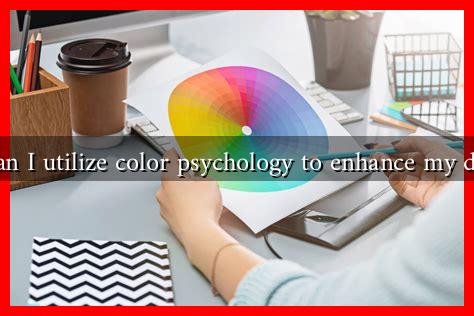
Color combinations can enhance or detract from your design. Use the color wheel to create harmonious palettes. Here are some popular combinations:
- Complementary: Colors opposite each other on the wheel (e.g., blue and orange) create high contrast and vibrancy.
- Analogous: Colors next to each other (e.g., blue, blue-green, and green) create a serene and comfortable design.
- Triadic: Three colors evenly spaced on the wheel (e.g., red, yellow, and blue) offer a balanced and dynamic look.
Case Studies: Successful Use of Color Psychology
Several brands have successfully utilized color psychology to enhance their designs:
- Coca-Cola: The iconic red color evokes excitement and energy, making it a perfect fit for their branding.
- Facebook: The blue color scheme promotes trust and reliability, essential for a social media platform.
- Starbucks: The green color represents growth and freshness, aligning with their brand message of sustainability.
Conclusion
Incorporating color psychology into your designs can significantly enhance their effectiveness and appeal. By understanding the emotional associations of colors, defining your brand identity, considering cultural contexts, and using color combinations wisely, you can create designs that resonate with your audience. Remember, the right color choices can lead to increased brand recognition and consumer engagement. For further reading on color psychology, you can explore resources like Color Psychology.


