-
Table of Contents
Can You Combine Earth Tones with Bold Colors?
In the world of design and fashion, color combinations can make or break a project. One intriguing question that often arises is whether earth tones can be effectively combined with bold colors. Earth tones, characterized by their muted, natural hues, evoke a sense of calm and stability. In contrast, bold colors are vibrant and energetic, often used to make a statement. This article explores the compatibility of these two color families, offering insights, examples, and tips for successful combinations.
Understanding Earth Tones
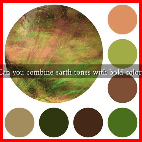
Earth tones are colors that are inspired by the natural world. They include shades of brown, green, beige, rust, and terracotta. These colors are often associated with warmth, comfort, and a connection to nature. Here are some key characteristics of earth tones:
- Neutrality: Earth tones are generally neutral, making them versatile and easy to pair with other colors.
- Warmth: They evoke feelings of warmth and coziness, often creating a welcoming atmosphere.
- Timelessness: Earth tones have a classic appeal that transcends trends, making them a staple in design.
The Allure of Bold Colors
Bold colors, on the other hand, are vibrant and eye-catching. They include shades like bright red, electric blue, and vivid yellow. These colors are often used to create focal points or to inject energy into a space. Here are some characteristics of bold colors:
- Attention-Grabbing: Bold colors naturally draw the eye, making them perfect for accent pieces.
- Emotional Impact: They can evoke strong emotions and set the mood of a space or outfit.
- Trend-Driven: Bold colors often reflect current trends and can be used to make a statement.
Combining Earth Tones with Bold Colors
The combination of earth tones and bold colors can create a striking visual balance. Here are some effective strategies for merging these two color families:
1. Use Bold Colors as Accents
One of the simplest ways to combine earth tones with bold colors is to use the latter as accents. For example, a room painted in warm beige can be enhanced with bright orange cushions or a vibrant blue artwork. This approach allows the earth tones to provide a calming backdrop while the bold colors add energy and interest.
2. Create a Color Palette
When combining these colors, it’s essential to create a cohesive color palette. A good rule of thumb is to choose one or two bold colors to pair with several earth tones. For instance, a palette of olive green, terracotta, and mustard yellow can create a harmonious yet dynamic look.
3. Consider Proportions
The proportion of earth tones to bold colors can significantly affect the overall aesthetic. A larger presence of earth tones can ground the space, while smaller doses of bold colors can provide pops of excitement. For example, a living room with a brown sofa (earth tone) can be complemented by bright red throw pillows (bold color).
Case Studies and Examples
Many designers have successfully combined earth tones with bold colors in various projects. For instance, the renowned interior designer Kelly Wearstler often uses this combination in her work. In one of her projects, she paired deep green walls (earth tone) with vibrant pink furniture (bold color), creating a stunning contrast that feels both modern and inviting.
In fashion, brands like Anthropologie frequently showcase outfits that blend earthy hues with bold accessories. A rust-colored dress (earth tone) paired with a bright yellow handbag (bold color) exemplifies how these colors can work together to create a striking look.
Conclusion
Combining earth tones with bold colors is not only possible but can also lead to visually stunning results. By using bold colors as accents, creating a cohesive color palette, and considering proportions, you can achieve a balanced and dynamic aesthetic. Whether in interior design or fashion, this combination allows for creativity and expression while maintaining a sense of harmony. Embrace the challenge of mixing these color families, and you may discover a new world of design possibilities.
For more insights on color theory and design, consider visiting Adobe Color, a resource that can help you explore various color combinations and palettes.

